Advertising and place
Advertising in London: Why the City Still Rewards Clear Visual Communication
London has always put commercial messages into crowded public space. The formats keep changing, but the challenge remains familiar: earn attention without requiring the audience to stop and study the message.
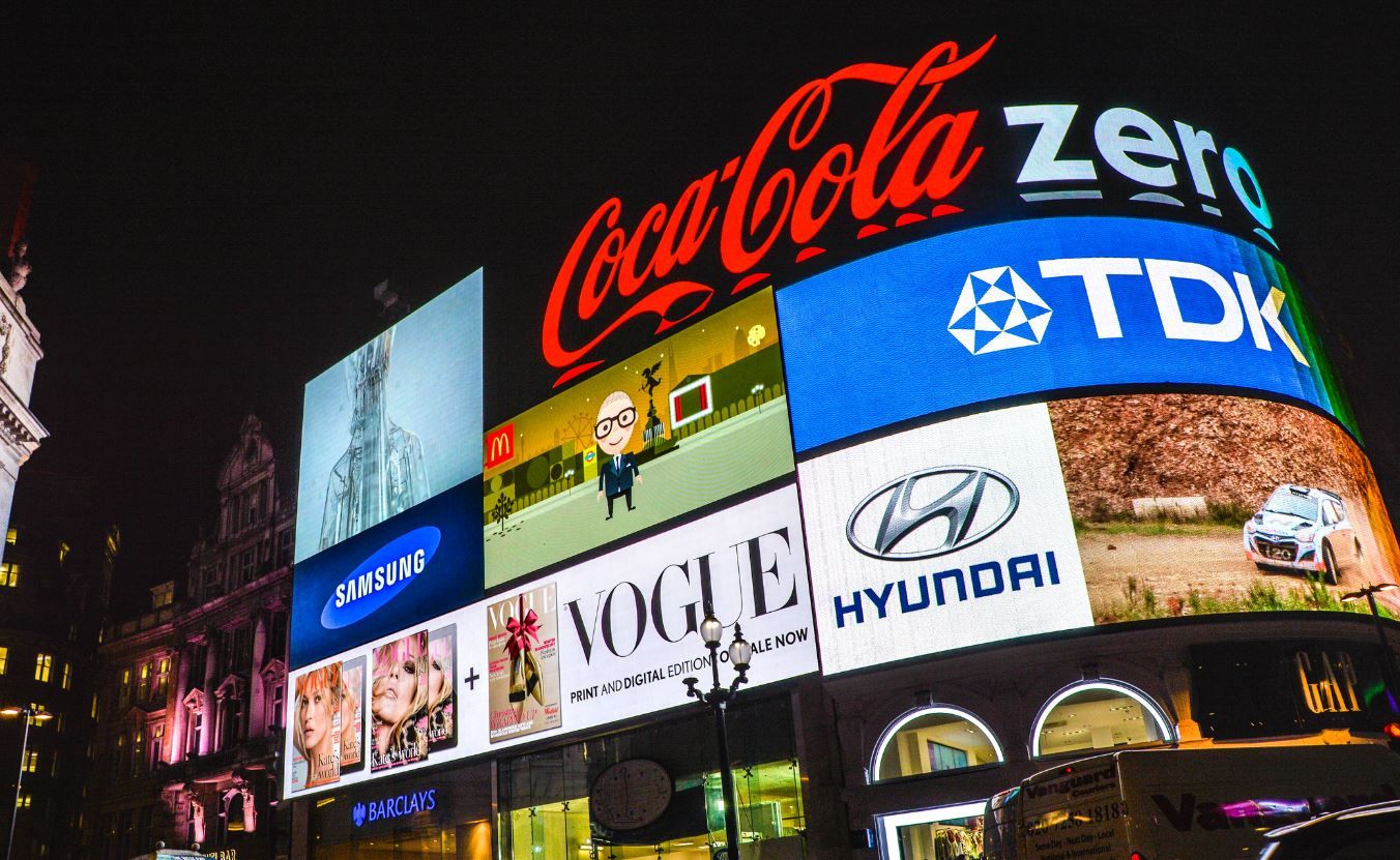
A city creates difficult conditions for advertising. People are moving, streets are visually busy, businesses sit close together and messages compete with transport information, architecture, shopfronts, screens and one another. That makes London a useful place to think about what actually earns attention.
Physical advertising begins with location
A shop sign, vehicle graphic, poster or banner is encountered because somebody is physically near it. The location therefore does part of the targeting. A beautifully designed sign in the wrong position can fail, while a simple message in the right sightline may become familiar through repeated exposure.
That is the continuing value of well planned signs London businesses use across premises, vehicles and temporary displays. The physical object gives the brand a place in the environment rather than asking the audience to discover it only through a screen.
The medium changes faster than the underlying problem
Painted lettering, printed posters, illuminated signs, vehicle graphics and digital screens use different production methods, but each has to answer the same questions. Who will see it, for how long, from what distance and what is the one thing they should understand first?
Digital advertising adds different forms of targeting and measurement, but it does not remove those communication principles. A paid advert can be served to the perfect audience and still fail because the message is unclear. Better targeting cannot rescue weak hierarchy indefinitely.
Recognition is built through repeated cues
The same business may be encountered on a van in the morning, through search later in the day and on a sign when the customer finally arrives. Those moments feel connected when the name, typography, colour, tone and general level of clarity belong to the same identity.
- Make the business name easy to identify before secondary information.
- Design for the viewing conditions of the medium rather than one desktop proof.
- Repeat recognisable brand cues across physical and digital touchpoints.
- Use location, search intent or audience targeting according to the job each medium is doing.
- Measure outcomes where possible, but do not confuse a large reporting number with useful attention.
A crowded city makes restraint valuable
When everything around the audience is asking to be noticed, adding more elements can make a message easier to ignore. Restraint gives important information room to register. That can mean a shorter headline, a larger name, fewer services on a vehicle or a simpler landing page after somebody searches for the business.
The formats used to advertise in London will keep changing. The useful design principle is more durable: understand the moment in which the audience meets the message, then remove anything that gets in the way of the thing they need to notice or remember.