The Power of Perception: Examining the Repercussions of Great British Energy's Logo and Branding
A state-owned energy firm that has been the subject of intense controversy and investigation
In an era when first impressions are more important than ever, a company's visual identity is critical to moulding public image. This is especially true for
Great British Energy (GBE), a state-owned energy firm that has been the subject of intense controversy and investigation. The
company's logo and branding were deliberately designed to convey feelings of national pride and environmental responsibility, but a closer look shows a more complicated picture.
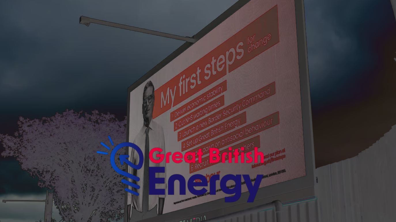
The GBE logo depicts a stylised Union Jack, a symbol of British identity, encircled by a circular shape like a sun, or planet or both? The primary colours utilised are red and blue.
The usage of the Union Jack in the logo is an obvious attempt to appeal to the public's feeling of national pride and patriotism. By associating GBE with the country's identity, the corporation positions itself as an organisation working for the better interest of the British public. This is a powerful message that will appeal to a wide range of people, particularly those worried about the country's energy independence and transition to a more environmentally friendly future.
However, the usage of the Union Jack might be seen as a type of "greenwashing," in which a firm employs environmental images to provide the idea of sustainability. While GBE professes to invest in renewable energy projects, the truth is that it is largely an investment organisation rather than an energy producer. This disparity between the company's branding and its real operations might cause misunderstanding and dissatisfaction among the public.
The colours used in the GBE emblem are also noteworthy. Blue is generally associated with trust, dependability, and stability. GBE is seeking to represent itself as a reputable and ecologically conscious corporation by adopting these colours. However, the viability of this strategy is dependent on the company's ability to keep its commitments and demonstrate meaningful progress in the battle against climate change.
Another crucial consideration is the typefaces used in GBE branding. The company's logo uses a strong, sans-serif typeface that expresses modernism and simplicity. This font selection is designed to make GBE look approachable and forward-thinking, appealing to a younger, more ecologically concerned audience.
The success of GBE's branding ultimately hinges on the company's ability to keep its promises and generate meaningful outcomes in the battle against climate change. If GBE fails to make a substantial effect in the renewable energy sector, its meticulously developed logo and branding may be viewed as merely
a marketing technique.
Great British Energy's logo and branding are intended to convey a feeling of national pride, environmental responsibility, and modernism. However, the viability of this strategy is dependent on the company's ability to keep its commitments and demonstrate meaningful progress in the battle against climate change. Only time will tell if GBE can live up to its slogan and establish itself as a real advocate of renewable energy in the UK.