Branding
Why Beauty Packaging Matters Before a Product Is Ever Used
Packaging shapes expectations long before someone experiences the product. Materials, colour, typography and structure influence trust, perceived quality and purchasing decisions before the lid is ever opened.
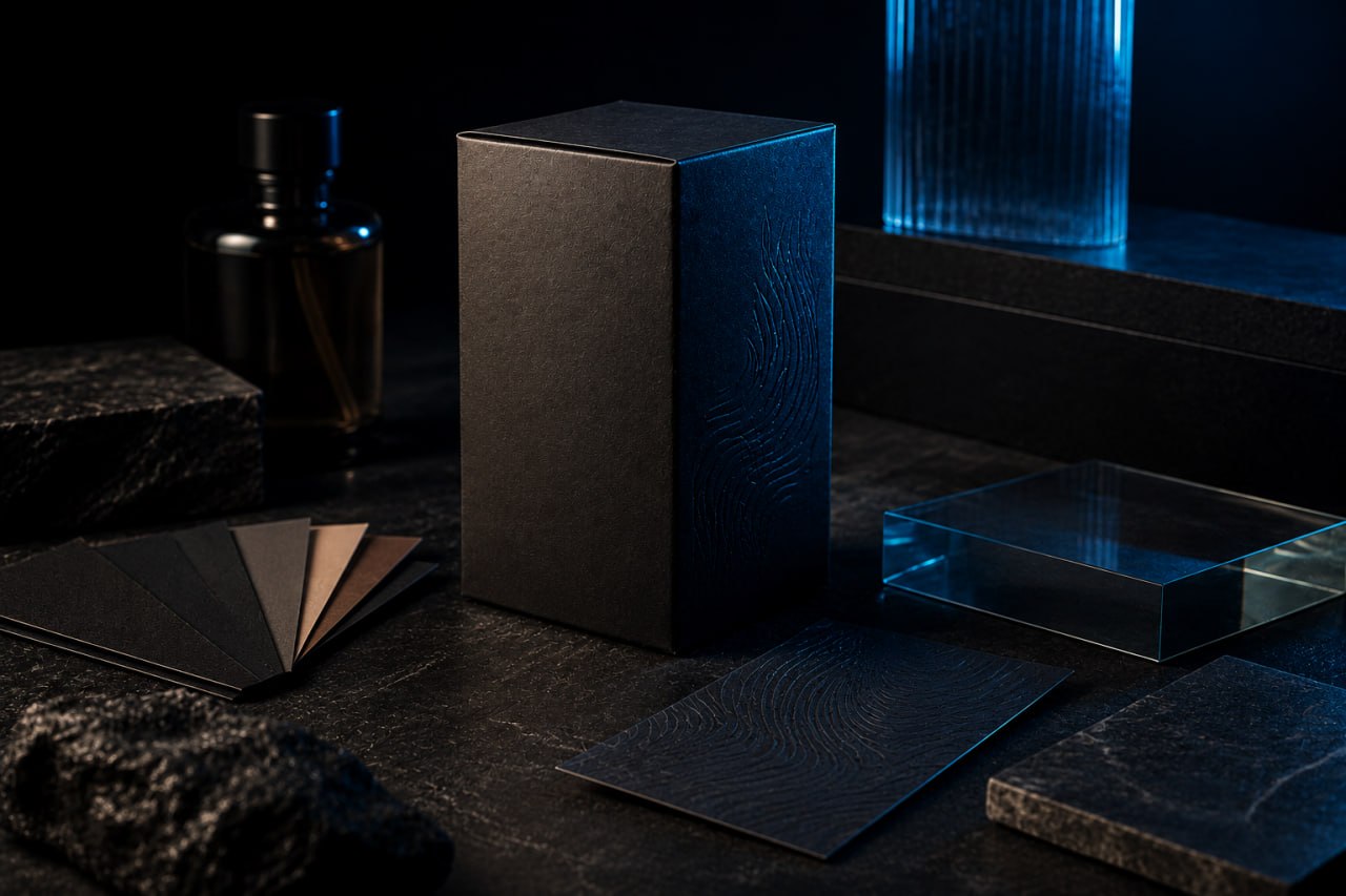
Long before someone tries a beauty product, they begin forming an opinion about it. The packaging is often the first physical expression of the brand, shaping expectations through its materials, typography, colour and construction. The weight of a glass bottle, the texture of a label, the sound a closure makes when it is first opened: these arrive before the formula inside has been experienced at all.
Beauty packaging designers have understood this sequence for decades. What they have learned about material quality, visual coherence and the communication of value through physical form applies wherever a product needs to justify its place on a shelf or in a basket.
First impressions begin before the product
A customer choosing between two items of similar function will often make a judgement based on what they can see and touch before opening. This is not superficial. The form is the product at the point of selection. It carries the information the customer uses to form expectations.
Research published in the Journal of Consumer Behaviour has found that visual and tactile qualities of packaging influence perceived quality and purchase intent in ways that operate below conscious decision making. A person does not typically think "this bottle feels expensive, therefore I trust it". They simply feel more assured about the choice they are about to make.
This means the form is not a container. It is a communication tool that must perform before the item inside ever gets a chance to.
Packaging communicates without words
Colour is the most immediately legible signal. A muted neutral palette reads differently from high saturation or metallic finishes. Neither is correct in isolation. The question is what the company needs to communicate and to whom.
Typography must work at the small scale of a label, on matte paper, gloss film and textured board, without the opportunity for the reader to adjust their distance or lighting. A typeface that reads confidently in a design mockup may become illegible under shop lighting.
Material choice carries meaning beyond aesthetics. A heavy-walled glass bottle implies substance. A lightweight tube implies portability. A paperboard carton implies consideration and, in some categories, environmental responsibility. These are associations the customer brings to the decision, not messages the company has to explain.
Finishes work by creating contrast. A spot-gloss panel on a matte label draws attention to a specific element. A soft-touch laminate creates the impression of texture without requiring physical interaction. Foil blocking on a closure adds authority to a name in the same way a heavy door handle makes a building feel substantial before you step inside.
Proportion and structural design determine how the form sits in the hand and how it performs in storage. A well-proportioned bottle is easy to grip. A cap that requires excessive force or makes a poor sound when opened disrupts the relationship between customer and item at a moment when credibility is most vulnerable.
Consistency builds confidence
Customers do not encounter a form in isolation. They arrive having already formed impressions from a company's website, its social media presence, its retail environment and its advertising. The physical form either reinforces those impressions or introduces doubt.
When a company communicates a particular character digitally, the physical form should feel like the same organisation speaking in a different medium. The colours should match. The typographic tone should be consistent. The material quality should suggest the same level of care. A site that communicates quiet authority should not lead to a form that feels ordinary.
This consistency matters most for goods sold across multiple channels. An item that looks one way on screen, another when it arrives in an ecommerce box, and another again on a retail shelf has created three different expectations in the same customer.
Premium is about judgement, not decoration
There is a common misconception that premium forms require more: more colour, more finish, more structural complexity, more metallic detail. In practice, the most effective premium work is characterised by restraint.
The Ordinary, part of the Deciem group, built its identity around rigorous minimalism in both formula and form. Its bottles are typically clear or opaque plastic with a straightforward label. The absence of embellishment suggests the investment went into what is inside rather than what surrounds it. This is a deliberate design position, not a cost-saving measure. It requires the same level of judgement as more elaborate approaches.
By contrast, companies that overload their forms with texture, metallic effects and structural complexity often undermine their own position. The message becomes unclear. Is this item expensive because of what is inside or because of what is on the outside? The customer cannot easily tell, which means the premium positioning is not landing.
The principle holds across categories. A restaurant that uses clean, well-proportioned tableware and simple linen communicates care through restraint. The quality of the food does not need to be announced through elaborate presentation. Forms that work the same way earn assurance by suggesting the company does not need to compensate for weaknesses with decoration.
Good packaging must survive the real world
Beauty products move through demanding conditions. They travel in bags, sit in bathroom cabinets with fluctuating temperature and humidity, are handled with wet hands, and may be shipped considerable distances. A form that looks immaculate in a studio photograph but arrives dented or with a label that has lifted at the edge has failed its primary function.
For goods sold online, the challenge is more acute. Ecommerce forms must survive automated sorting, multiple handling points and potential impact. The outer layer must protect. The inner structure must hold and present the item. Both requirements must be met simultaneously.
Sustainability has added another layer of complexity. Companies face genuine pressure to reduce material use and avoid mixed-material structures that are difficult to recycle. This constraint has produced some of the more interesting recent developments in packaging design, particularly the return to mono-material structures and the rethinking of secondary packaging.
Beauty has influenced packaging far beyond cosmetics
The beauty industry has driven packaging innovation for reasons that go beyond the product category itself. Beauty companies were early adopters of material quality as a communication tool. They developed expertise in colour consistency across print and physical substrates, and built knowledge about how forms perform through supply chains and in retail environments.
That expertise has spread. Food and beverage companies have adopted the material standards and design coherence once specific to beauty. The premium olive oil aisle now resembles the skincare section of a department store. Artisan food producers use design practices that originated in cosmetics.
Technology goods have absorbed the lesson differently. Consumer electronics companies with design credibility apply the same rigour to the physical form as to the engineering. The unboxing sequence is considered, the materials are deliberate, and the first impression is protected until the item itself is revealed.
Packaging reduces uncertainty
Before a customer opens an item, they are making a decision with incomplete information. They have the company name, the product description, the price and the physical form. Of these, only the form can be examined before committing.
People often decide how they feel about a product before they experience it. Thoughtful packaging reduces uncertainty by making products feel coherent, trustworthy and carefully considered.