Visual storytelling
How Longlegs Uses Minimalism to Create Unease
Minimalism is not always calm. In horror, empty space, withheld information and controlled typography can make an image feel more threatening precisely because the viewer is forced to complete what is missing.
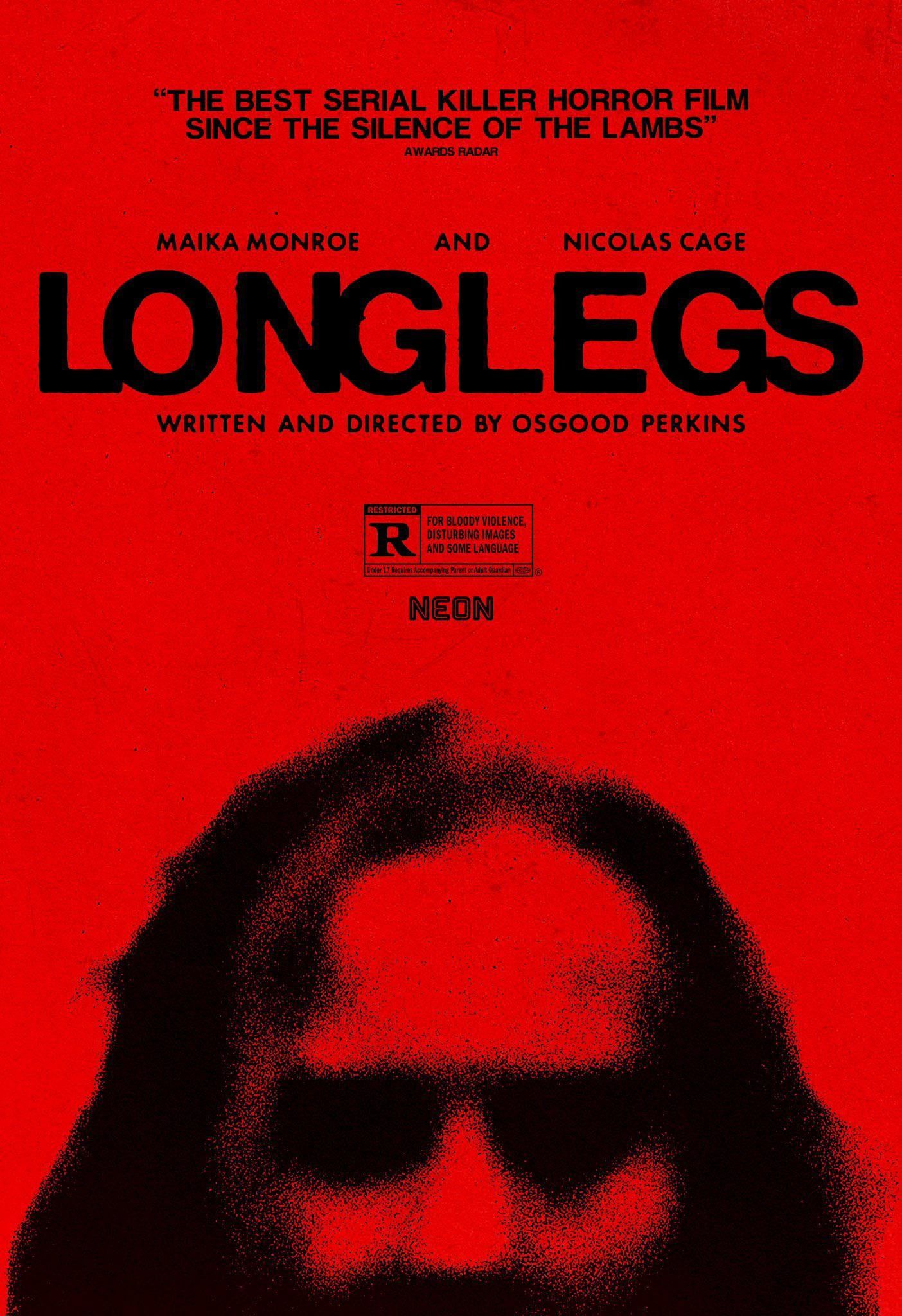
Minimal design is often associated with elegance, calm and clarity. Horror can use the same visual tools for the opposite purpose. Remove enough information and the empty space stops feeling peaceful. It begins to feel like something has been withheld.
The visual campaign around LongLegs is a useful example of restraint being used to create uncertainty rather than reassurance. The imagery does not need to explain everything because the missing information becomes part of the tension.
Negative space can feel active rather than empty
In a conventional advert, unused space is often treated as room waiting to be filled. In suspense and horror, that space can become the subject. A large quiet area around a face, figure or object gives the viewer time to inspect what is there and wonder what may exist outside the frame.
That effect depends on confidence. If the composition is weak, the space simply feels unfinished. When scale, crop and balance are controlled, the emptiness feels deliberate and the viewer starts to supply their own meaning.
Withholding information makes the viewer participate
A poster does not have to tell the whole story. In fact, mystery disappears when the image explains too much. Fragments, partial faces, distant figures and ambiguous symbols can create a question that the viewer wants answered elsewhere.
That is different from being vague for its own sake. The image still needs a clear emotional direction. The audience may not know exactly what they are looking at, but they should know how it is meant to feel.
Typography can carry tone without becoming theatrical
Horror design often becomes predictable when every title is distressed, scratched or aggressively stylised. A restrained type treatment can be more unsettling because it refuses to signal the genre too loudly. Clean typography beside disturbing imagery creates tension between order and threat.
The lesson extends beyond film. Type does not need to imitate the subject literally. It can create a counterpoint. A serious identity may use quiet typography around expressive imagery, while a highly technical product may gain warmth from a more human visual voice.
Repetition turns restraint into identity
One minimal poster can look sparse. A sequence of related images, crops, colours and typographic decisions begins to look like a system. Repetition tells the audience that the absence is deliberate and makes the campaign recognisable without requiring every asset to be identical.
- Choose one dominant visual idea rather than several competing effects.
- Use crop and scale to control how much information is revealed.
- Let typography support the emotional tone instead of illustrating it literally.
- Repeat a small number of visual rules across the campaign.
- Leave enough unresolved that the viewer has a reason to look again.
Minimalism works when every remaining element matters
Removing elements does not automatically make design sophisticated. The fewer things left on the page, the more pressure each one carries. A weak image, careless crop or arbitrary type choice becomes more obvious because there is nowhere for it to hide.
That is what makes restrained horror design interesting. Minimalism is not the absence of communication. It is concentrated communication, with silence and uncertainty treated as active parts of the message.