Product and brand
Dyson: When Product Design Becomes Brand Recognition
Some brands are recognised as much by the object as by the logo. Dyson is a useful example of product engineering, visible function and industrial design becoming part of the identity itself.
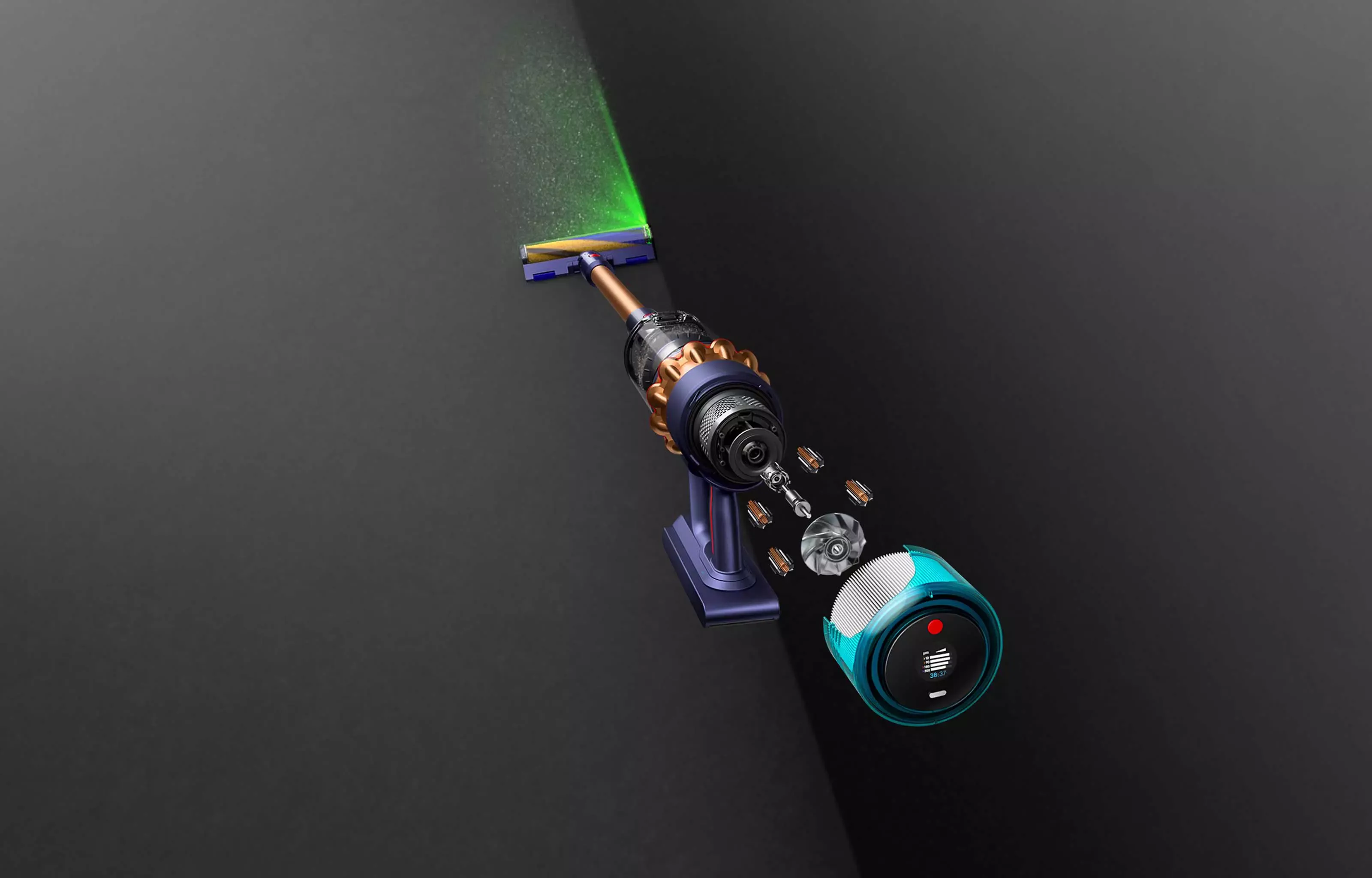
A product brand becomes particularly strong when the physical object carries the identity before the customer notices the logo. Shape, engineering details, material, colour and the way the product exposes its function can all become recognisable signals in their own right.
Dyson is a useful case study because its products have often made engineering visibly part of the experience. Components that another manufacturer might hide can become part of the form, helping the object explain something about how it works while also contributing to recognition.
The product can carry more identity than the logo
Graphic identity usually sits on top of an object. Product design can go further because the object itself becomes recognisable. Proportion, silhouette, controls, vents, transparent parts and recurring construction details can create a family resemblance across products without forcing every item into the same shape.
This is the physical equivalent of a good visual system. Recognition comes from repeated principles rather than from placing a larger logo on every surface.
Visible function can support the brand story
When a product lets the user see airflow, movement, filtration, mechanics or another aspect of its operation, the design is doing two jobs. It is creating visual interest and helping explain why the product exists in that form.
That connection between appearance and function is important. A visual feature feels more credible when it is not merely decorative. The customer can connect the unusual form with the product claim rather than treating it as styling added afterwards.
Technical products still need simple communication
Engineering can be complex, but the customer does not need every technical detail at once. Product communication works best when it translates the important difference into a small number of understandable ideas, then allows deeper information to sit underneath for people who want it.
The same principle applies to websites and sales material for less glamorous technical businesses. Expertise becomes more persuasive when the customer can understand the practical consequence without first learning the vocabulary of the industry.
A recognisable family does not require identical products
A vacuum cleaner, hair tool and air treatment product solve different problems, so forcing them into one literal shape would make little sense. A brand family can instead repeat more abstract qualities: visible engineering, controlled colour, material contrast, precise detail and a consistent attitude to how technology is presented.
- Let the product or service demonstrate the brand promise wherever possible.
- Use design details that have a reason to exist rather than decoration for its own sake.
- Repeat principles across a range without making every item visually identical.
- Translate technical complexity into clear customer benefits before adding depth.
- Treat the physical object, packaging, website and support material as parts of one experience.
The strongest identity is often built into the thing being sold
A logo can be copied quickly. A coherent relationship between product, engineering, communication and customer experience is much harder to imitate. That is why product led brands can become recognisable at a deeper level than surface graphics alone.
The broader design lesson is useful for any business: branding becomes more credible when the promise is visible in the product, service or experience itself. The graphic system should reveal that difference, not invent one that the customer cannot find anywhere else.