01
The result
Queens Park
Property Co.
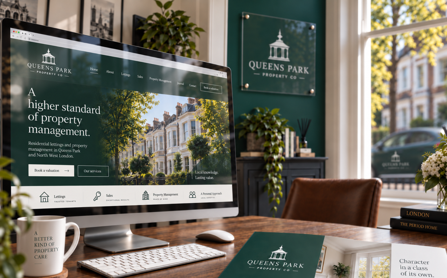
A distinctive property identity built from a genuine piece of Queen’s Park.
02
The brief
Premium. Dependable. Established.
Residential lettings and property management for landlords and tenants in Queen’s Park and North West London.
Residential lettingsProperty managementLandlords & tenantsNorth West LondonMonochrome firstWeb & printDirection open
The first design stage stayed deliberately monochrome. The mark had to work before colour was allowed to influence the decision.
03
Looking beyond property clichés
Not another
estate agent.
The obvious property symbols were deliberately removed from the conversation.
Houses
Keys
Roof shapes
Doorways
Map pins
So we looked closer to home. To Queen’s Park itself.
04
The local discovery
The idea was
already there.
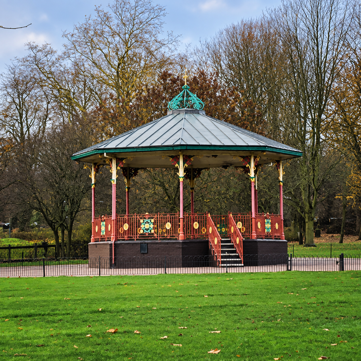
Situated in Queen’s Park, Brent, the bandstand was constructed in 1887, with ironwork by Walter MacFarlane & Co of Glasgow. Its ornate octagonal structure is built from cast iron and timber beneath a leaded roof.
It gave us something a generic property symbol could not. A genuine piece of Queen’s Park.
1887Constructed in Queen’s Park
Walter MacFarlane & CoGlasgow ironwork
Early London examplePredating the main wave of municipal park bandstands after 1890
Still in useRestored and once again hosting summer music
05
Concept exploration
We explored three ways to turn the bandstand into a usable identity.
Each route kept the local reference, but tested how directly it should appear in the mark.
Abstract pavilion profile
Q integrated with bandstand
Selected directionSimplified bandstand→
06
Refinement
One direction chosen. Then we refined the system.
The next stage was not about inventing another idea. It was about making the chosen identity simpler, clearer and usable everywhere it needed to appear.
01
Preferred bandstand route selectedThe strongest local idea became the basis of the identity.
02
LTD removed from the nameThe public facing identity was simplified to Queens Park Property Co.
03
Monochrome mark refined firstProportion and recognition were resolved before colour entered the project.
04
Logo system built around the master markPrimary, stacked, icon only and reversed uses were established.
05
Final mono identity approvedOnly then was the visual language ready to move into colour.
Approved monochrome identity
The mark was solved before the palette was allowed to influence it.
07
The identity
The approved monochrome identity.
Specific enough
to belong.
Primary mono
Reversed
Icon only
Colour deliberately came next.The structure of the identity had already been approved.
08
Colour development
Colour came after
the mark was approved.
Three distinct territories were explored. Each had a reason to exist. Only one felt inseparable from Queen’s Park.
APark Green
BVictorian Brick
CBandstand Iron
The approved palette.
Park Green.
Rooted in the mature greenery of Queen’s Park, supported by warmer architectural neutrals.
#18352FPark Green#D8CDBDWarm Limestone#F4F0E8Soft Ivory#181818Blackened Iron
09
The brand book
A complete guideline
for consistent use.
The finished identity was turned into a concise, client friendly brand book covering conception, logo rules, colour, typography, social use, website direction and applications.
BRAND GUIDELINESVERSION 1.0
OUR LOGO
Primary identity and approved variants.
COLOUR PALETTE
Park Green, Warm Limestone, Soft Ivory and Blackened Iron.
WEBSITE APPLICATION
Park Green opening, centred identity, generous breathing room.
APPLICATIONS
One system carried consistently across digital and physical touchpoints.
The PowerPoint presentation remained the master brand book because it preserved the designed quality better than the PDF conversion.
10
Taking it digital
The identity becomes
a digital presence.
The website direction begins with the brand itself: Park Green, the reversed logo, quiet navigation and enough space to let the identity breathe before property content takes over.
Property content follows below
Queen’s Park
Property Co
Property Co
Park Green→Centred identity→Breathing room→Property content
11
Into the real world
The brand leaves
the screen.
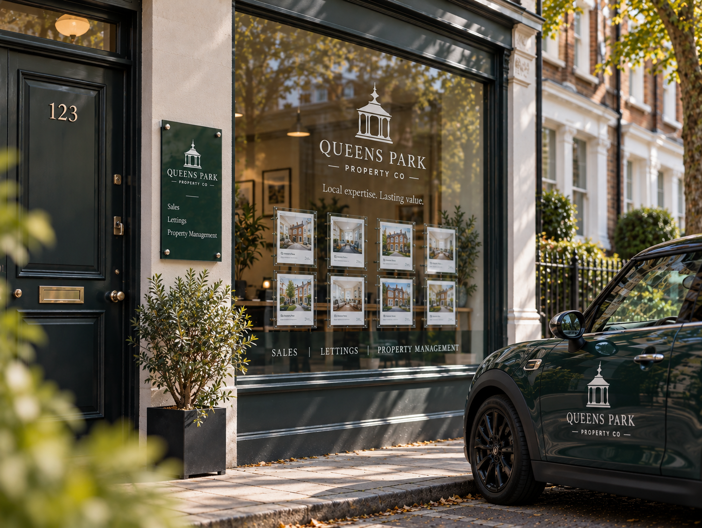
Plaques. Window graphics. Vehicles. Print.
Physical brand application concept12
The complete system
One idea.
One identity.
One consistent business presence.
Identity
Colour
BRAND
GUIDELINESBrand book
GUIDELINESBrand book
Digital
Physical13
What comes next
Concept→Identity→Digital→Physical→Growth
Your business.
Everywhere it matters.
Queens Park shows what happens when the same direction carries from the first idea through to the places customers actually meet the business.
Start a project →