Beauty branding
Beauty Branding: How Packaging, Product Families and Context Build Recognition
Beauty products compete in a visually dense market where the pack, product name, photography, creator coverage and retail environment all contribute to the same impression. The challenge is not to make every element louder. It is to make them belong together.
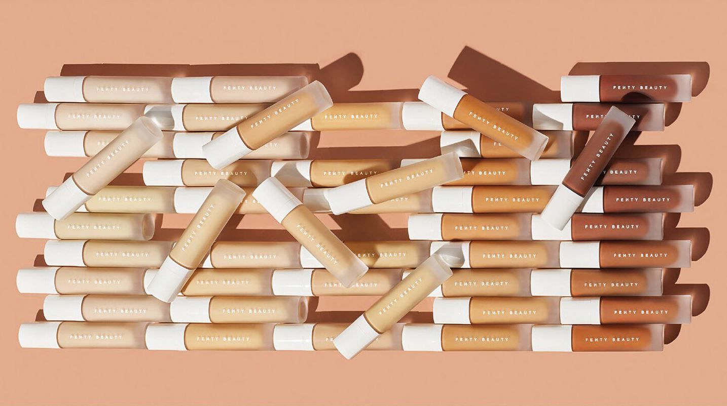
Beauty branding has to work at several scales at once. A brand may need to be recognisable from a campaign image, across a shelf or ecommerce grid, on a small carton and on the product in a hand. Each application carries different amounts of information, but the customer should still be able to connect them.
Branding is more than just a logo. In beauty, that becomes especially obvious because the customer repeatedly encounters the identity through packaging, product names, photography, retail pages, reviews and social content.
Packaging has to create hierarchy in very little space
A beauty pack may need to carry the brand, product name, shade or variant, quantity, required information and a number of claims. Good hierarchy decides what the customer should understand first instead of giving every line equal visual weight.
Fenty Beaut is one example of a beauty brand with a distinctive visual presence. The useful lesson is not to copy a particular colour or shape, but to understand how repeated design decisions make a range recognisable as it expands.
Colour can organise a range without pretending to control emotion
Colour is useful for recognition, contrast, variant coding and establishing a visual character. It is less useful to make universal claims that one colour automatically causes one emotion or buying response. Context, culture, category, surrounding design and previous experience all affect how colour is interpreted.
For a growing product family, the more practical question is whether colour helps customers distinguish products while still recognising the parent brand.
A product family needs both consistency and difference
If every product looks completely different, the brand loses cumulative recognition. If every product looks identical, navigation becomes difficult. Strong systems keep enough common structure to feel related while giving individual products enough distinction to be found quickly.
- Keep the brand recognisable across products without forcing every pack into the same solution.
- Give product type and variant information a clear hierarchy.
- Use colour as a practical design signal rather than a universal psychology claim.
- Design for small ecommerce thumbnails as well as physical handling.
- Allow reviews and creator content to add experience that the pack cannot communicate alone.
Reviews add use and experience to a visual identity
A product can look compelling and still leave practical questions unanswered. Reviews of products such as Kosas can add context about application, feel and everyday use that cannot be communicated by the pack alone.
Coverage of a specific product such as The Hotliner also shows how the customer journey can move between brand imagery, product information and independent editorial experience before a purchase decision is made.
The strongest beauty brands make many touchpoints feel like one system
Packaging, ecommerce, social content and creator coverage do not have to look identical. They need enough shared character and clarity that the customer can recognise the same brand while moving between them. Recognition grows when each encounter makes the next one easier to place.