The Evolution of Look Fantastic’s Branding
A Look Fantastic Journey Through Beauty and Brand Innovation
When you think of premium beauty retail, Look Fantastic is likely one of the first names that springs to mind. As Europe’s leading online beauty destination, it’s built a reputation for offering an unrivaled selection of high end skincare, haircare, makeup, and fragrance products. But behind the sleek website and carefully curated product range lies a fascinating story of branding evolution. From its humble beginnings as a salon based venture to its current status as a global beauty powerhouse, Look Fantastic’s branding has undergone significant changes, reflecting its growth, adaptability, and commitment to customer experience. Let’s look into the history of Look Fantastic’s branding and explore how it became the beauty authority it is today.
Roots in the Salon: The Birth of Look Fantastic (1978–1997)
Look Fantastic’s story begins not online but in the physical world of beauty salons. The company was born out of the Crown Salon Group, a Sussex based business founded in 1978. Known for its professional haircare expertise and specialised training centers for hairdressers, Crown Salon Group was a respected name in the UK’s beauty industry. The focus was on quality, professionalism, and making high end haircare accessible to both professionals and everyday consumers.
At this stage, there was no “Look Fantastic” brand as we know it today. The Crown Salon Group operated with a traditional, service oriented identity, rooted in the tactile, in person experience of salons. Its branding likely emphasised expertise and trust, with a focus on professional grade products and education. This foundation in haircare excellence would later become a cornerstone of Look Fantastic’s identity when it transitioned to the digital realm.
Going Digital: The Launch of Lookfantastic.com (1997)
In 1997, the Crown Salon Group took a bold step into the future by launching Lookfantastic.com, a move that was ahead of its time in the early days of e-commerce. The goal was simple yet ambitious: to make premium hair and beauty products more accessible to consumers beyond the salon chair. This marked the birth of the Look Fantastic brand as we know it, with a name that cleverly combined aspiration (“look fantastic”) with accessibility.
The initial branding of Lookfantastic.com was functional and straightforward, reflecting the era’s rudimentary web design. The logo and website likely leaned on clean, professional aesthetics, with a focus on showcasing trusted brands like Kérastase, Redken, and GHD. The name itself was a masterstroke, memorable, aspirational, and perfectly aligned with the beauty industry’s promise of transformation. It spoke directly to consumers who wanted to feel confident and glamorous without needing to visit a salon.
During this period, Look Fantastic’s branding was all about bridging the gap between professional expertise and at home beauty. The website emphasised product authenticity, expert advice, and a curated selection, setting it apart from general retailers. This focus on quality and trust laid the groundwork for the brand’s future success.
Acquisition by THG: A New Era of Growth (2010)
A pivotal moment in Look Fantastic’s history came in 2010 when it was acquired by The Hut Group (now THG Holdings plc) for £19.4 million. This acquisition marked a turning point, propelling Look Fantastic from a successful niche retailer to a global player in the beauty industry. THG’s expertise in e-commerce and its robust technological infrastructure allowed Look Fantastic to scale rapidly, expanding its product range and international reach.
Post acquisition, Look Fantastic’s branding began to evolve to reflect its new ambitions. The logo was modernised, adopting a sleek,
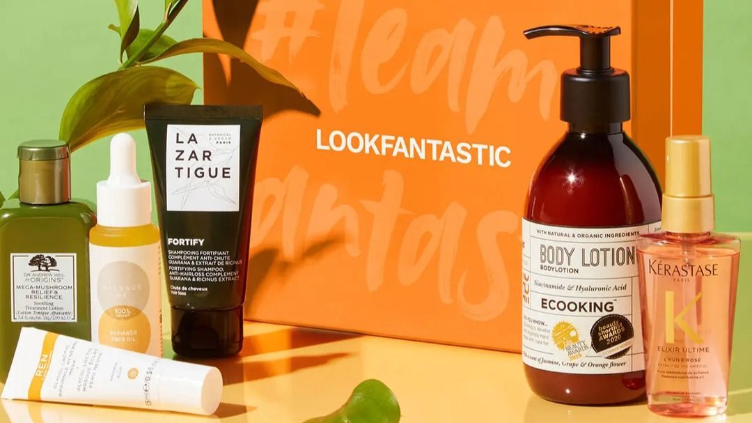
minimalist design with a sophisticated black and white color palette that screamed luxury. The website underwent significant upgrades, becoming more user friendly and visually appealing, with a focus on seamless navigation and personalized customer experiences. The branding leaned heavily into the idea of “premium beauty,” emphasizing exclusivity and variety by stocking over 600 high end brands, from Yves Saint Laurent to Estée Lauder.
This era also saw the introduction of localised websites in multiple languages, catering to a growing international audience. Look Fantastic’s branding became synonymous with global accessibility, offering free shipping to over 200 countries and a polished, professional image that resonated with beauty enthusiasts worldwide. The tagline “Look Good, Feel Fantastic” began to appear in marketing materials, encapsulating the brand’s mission to empower customers through beauty.
Expanding the Experience: Pop-Ups and Personalisation (2010s–2020s)
As Look Fantastic grew, its branding strategy became more dynamic, incorporating experiential elements to deepen customer engagement. The company began experimenting with pop-up events in the early 2020s, bringing its digital first brand into the physical world. A notable example was the 2022 pop up at Manchester’s Trafford Centre, which featured a conveyor belt showcasing bestselling products, a playful nod to the brand’s vast online catalog. Subsequent pop ups, like the Valentine’s Day activation at Manchester Arndale in 2023 and a festive London pop up later that year, reinforced Look Fantastic’s commitment to immersive, memorable experiences.
These pop-ups were a branding triumph, blending digital innovation with in person excitement. They allowed customers to interact with products from brands like Sol de Janeiro and NARS in real life, reinforcing the brand’s reputation as a trendsetter. The visual identity during these events was vibrant yet cohesive, with bold colors and clean designs that mirrored the sleek aesthetic of the website.
Look Fantastic also leaned into personalisation, launching initiatives like the LF Beauty Plus+ subscription program and Beauty+ Rewards, which rewarded loyal customers with points and exclusive offers. The brand’s blog, led by beauty experts, became a hub for educational content, offering tips and tutorials that aligned with its mission to empower customers. This content driven approach strengthened Look Fantastic’s branding as not just a retailer but a trusted beauty authority.
The First Physical Store: Blending Digital and IRL (2024)
In September 2024, Look Fantastic took a monumental step by opening its first permanent physical store in Altrincham, Cheshire. This move was a natural evolution for a brand with retail roots in the Crown Salon Group, but it also signaled a bold new chapter in its branding journey. The concept store, featuring 90 curated brands, was designed to bridge the gap between the digital and physical beauty experience.
The store’s branding is a masterclass in omnichannel retail. It retains the sleek, modern aesthetic of the website, think minimalist displays, elegant product arrangements, and interactive elements like personalized beauty services. The choice of Altrincham, a location close to THG’s Manchester headquarters, was strategic, allowing Look Fantastic to test its brick and mortar concept in an underserved yet accessible area. The store’s launch was accompanied by a campaign emphasising “IRL beauty,” inviting customers to touch, try, and explore products in a way that online shopping couldn’t replicate.
This physical presence also allowed Look Fantastic to showcase its partnerships with luxury brands like The White Company, which joined its portfolio in November 2024. The store’s branding emphasises exclusivity and discovery, encouraging customers to explore new products while staying true to the premium, aspirational identity Look Fantastic has cultivated online.
Advocacy and Innovation: The “What the SPF?” Campaign (2024)
Look Fantastic’s branding has never been static, it’s always evolving to reflect cultural and industry trends. In 2024, the brand launched its “What the SPF?” campaign, a bold initiative advocating for sun protection and calling for SPF products to be VAT free in the UK. By offering a 20% discount on SPF products (factor 30 and above), Look Fantastic positioned itself as a socially conscious brand, aligning with growing consumer awareness of skin health and affordability.
This campaign was a brilliant example of purpose driven branding. It combined education (through the brand’s expert led blog) with actionable discounts, reinforcing Look Fantastic’s role as a leader in the beauty industry. The campaign’s vibrant, sun inspired visuals and catchy messaging (“What the SPF?”) added a playful yet impactful layer to the brand’s identity, showing that it could be both fun and socially responsible.
The Look Fantastic Brand Today: A Global Beauty Authority
Today, Look Fantastic’s branding is a seamless blend of luxury, accessibility, and innovation. Its logo, a sleek, sans serif wordmark in bold black, exudes confidence and sophistication, while its website and physical store prioritise user experience and personalisation. The brand’s portfolio of over 660 premium brands, from cult favorites like Sol de Janeiro to luxury staples like Tom Ford, reflects its commitment to variety and quality.
Look Fantastic’s partnerships with niche beauty experts like
Nicola Londors, and high profile stars such as with
Molly-Mae Hague in 2024 and The White Company, show its ability to stay relevant and attract diverse audiences which drive
beauty product sales via influence. Its omnichannel approach, combining a best in class website, engaging pop ups, a permanent store, and advocacy campaigns, has solidified its position as a global beauty authority.
What’s Next for Look Fantastic?
As Look Fantastic continues to grow, its branding will likely evolve further to embrace new technologies and consumer trends. The success of its Altrincham store could pave the way for more physical locations, each designed to offer immersive, personalised experiences. With THG’s backing and a focus on sustainability (evident in campaigns like “What the SPF?”), Look Fantastic is well positioned to lead the beauty industry into the future.
The brand’s journey from a Sussex salon to a global e-commerce giant is a testament to its ability to adapt while staying true to its core values: quality, accessibility, and empowerment. Whether you’re browsing its website, visiting its store, or engaging with its latest campaign, Look Fantastic’s branding invites you to look good, feel fantastic, and embrace the joy of beauty.