Design
Pretty Does Not Always Mean Good Design
A polished design can look impressive and still make a simple job harder. Good design has to do more than sit there looking pleased with itself.
We are naturally drawn to things that look attractive. A smart colour palette, elegant lettering and plenty of carefully arranged space can make almost anything feel impressive. Add a moody photograph of somebody staring out of a window and the design may even appear to have a strategy.
Because the work looks polished, we assume it must also be good. That is where appearance and design quality start to become confused. There is nothing wrong with making something look good, of course. Attractive design can create trust, hold attention and make a business feel more professional. The problem is that appearance alone tells us very little about whether the design is clear, suitable or useful.
Looking good is only part of the job
Imagine a beautifully designed website for a local plumbing company. The photography is excellent, the colours are tasteful and the pages move smoothly as you scroll. Unfortunately, it takes several minutes to discover which areas the company covers, whether it handles emergencies or how to call anybody. The telephone number is hiding in a small menu, perhaps enjoying some privacy.
The website may be attractive, but it is not doing its job particularly well. Now imagine a much simpler website. It may not win any awards, but within a few seconds the customer can understand what the company does, where it works, why it can be trusted and how to make contact. The second website may be less fashionable, but it is probably the better design.
Good design helps people understand something or do something. Pretty design simply looks attractive. The strongest work manages to achieve both, but one does not automatically prove the other.
Personal taste is not the same as design quality
Everybody has different visual preferences. Some people like quiet colours and simple layouts. Others prefer bold lettering, bright colour and enough information to make full use of the available space. One person looks at a minimal design and sees quality. Another wonders whether the printer ran out halfway through.
Those reactions are personal. They tell us whether somebody likes the style, but they do not tell us whether the design works. You might dislike the colours on a sign while still admitting that it is clear and easy to read. You might love the appearance of a website while struggling to understand what the company actually offers.
The useful question is not simply whether you like it. The useful question is whether it helps the right person understand the right thing.
Good design has a clear purpose
Before judging a design, it helps to know what it is supposed to achieve. A roadside sign must be understood quickly and from a distance. A van needs to identify the business while it is moving, parked among other vehicles or covered in the usual amount of British road dirt. A website needs to help visitors find useful information and decide what to do next.
A design can look wonderful when viewed closely on a large screen and fail completely when placed in the real world. Small, delicate lettering may look refined in a presentation, but it becomes less impressive when nobody can read it from across the road. Subtle colours may feel sophisticated indoors, then disappear when used on a sign in poor weather.
Context matters. A design is only good when it works where it is actually needed.
Structure often matters more than decoration
Good design usually has a clear order. The important message is easy to find, related information sits together and the eye naturally moves through the content. Most people will not describe this as visual hierarchy or information structure. They will simply say that the design is easy to understand.
That ease is not accidental. A customer should not have to search a website for the telephone number. They should not need to read every word on a sign before discovering the main service. They should not be faced with six different buttons, all apparently competing for the honour of being clicked first.
Good structure makes the next step obvious. It removes unnecessary effort and allows the design to do its work quietly.
Customers notice more than they realise
Most customers will not carefully examine a logo, sign or website. They are unlikely to discuss the typeface over dinner or praise the consistency of the spacing. They will still form an impression. The business looks organised or untidy. It feels established or temporary. It appears expensive, affordable, specialist, friendly or difficult to understand.
These judgements often happen before the customer has spoken to anyone. The design does not prove that the company is competent, but it contributes to the limited information available. A polished design can create confidence, but only when the rest of the communication supports it.
A beautiful website that hides basic information may create the opposite effect. Customers do not generally enjoy playing hide and seek with opening hours.
A design can perform well without being pretty
Some designs are not especially attractive, yet they work extremely well. A large price on a bright advert may receive more attention than a refined alternative. A basic website may generate plenty of enquiries because it answers practical questions clearly. A simple sign may outperform a clever one because it can be understood in two seconds.
This does not mean ugly design is secretly better. It means clarity often matters more than decoration. It is also worth asking what performing well actually means. More website enquiries might sound positive, but not when most of them are unsuitable or interested only in the lowest possible price.
A design should support the result the business actually wants. More attention is not always better attention, just as more customers are not always better customers.
Attractive design still matters
It would be easy to take this argument too far and conclude that everything should be plain, practical and slightly grey. That is not the point. Appearance affects how people feel about a business. Good typography, appropriate colour and strong imagery can make information easier to approach. A consistent identity can make a company easier to recognise and help it appear more established.
Beauty has a useful role, but it should support the message rather than distract from it. A well designed website can be attractive and easy to use. A sign can be distinctive and readable. A van can look smart while still making the company name, service and contact details clear.
The choice is not between something beautiful and something useful. The job is to make it both wherever possible.
How to judge design more clearly
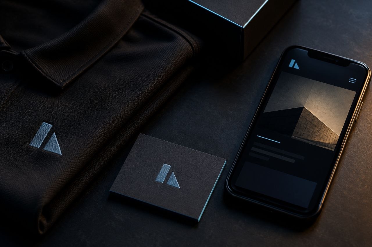
When looking at a design, it helps to separate personal taste from practical questions. Is the important information clear? Can it be read at the required size? Does it suit the business? Will the customer understand what to do next? Does the same identity work properly across signs, vehicles, clothing and screens?
These questions are more useful than deciding whether the design looks modern or whether the colour is personally appealing. A strong design should still make sense to somebody who does not share the designer’s taste. Equally, an attractive design should survive closer inspection once the initial visual impression has passed.
Pretty is not proof
There is nothing wrong with admiring a beautiful piece of design. Visual quality matters and can add real value to a business. It is simply not the only measure.
Good design is clear, appropriate and purposeful. It works in the place where it is needed and helps the intended audience understand the message. It may also be attractive, memorable and full of character.
Pretty is a quality. It is not proof that the design is good.